Talking-head ads: script, framing, delivery
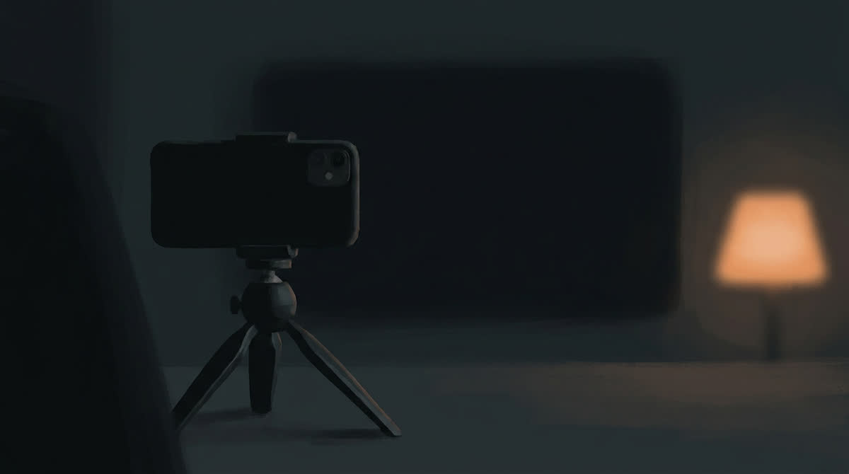
One person, to camera, for thirty seconds. It is the cheapest format to produce and the least forgiving, because there is nothing else in the frame to carry it. If the script is flat or the delivery is off, there is no cutaway to hide behind.
The script
A talking-head ad is four moves, and they are not the same four as a street interview.
Open on the viewer, not yourself. The first line should be about them. "If you're taking magnesium at night and still waking up at three —" beats "Hi, I want to tell you about" by a wide margin. Never open with a greeting.
Establish why you are worth listening to, in one clause. Not a biography. One clause, embedded in a sentence that is doing something else: "I spent four years selling this stuff, so —". Standalone credentials read as a résumé.
One idea, developed. The temptation in a talking head is to list benefits, because nothing is stopping you. Resist it. One idea, explained properly, outperforms four ideas mentioned. If you have four, you have four ads.
A close that names one action. Short, physical, singular.
Total: 70 to 90 words for thirty seconds. Count them. Almost every underperforming talking-head script is overwritten, and the symptom is a delivery that sounds rushed because it is.
Write it spoken
Write it the way the person talks, not the way you write. Contractions throughout. Sentences that run on. A word repeated because they could not find a better one. At least one self-interruption.
The test is reading it aloud in one breath per sentence. If you run out of air, the sentence is too long for speech regardless of how it reads on a page.
Framing
Three framings work, and they signal different things.
Chest-up, camera at eye level, slightly off-center. The default. Off-center — the speaker occupying roughly a third of the frame width, looking across the empty space — is more natural than dead center and leaves room for captions.
Held at arm's length, camera slightly above. The selfie framing. Reads as immediate and personal, and is the right choice when the script is confessional. Slightly above eye level is what a held phone actually does.
Waist-up, camera static, person moving. Works when the speaker is doing something — walking, making coffee, getting ready. The activity carries the parts of the script that are just information.
What does not work: a centered, chest-up, perfectly level shot with the speaker directly addressing the lens throughout. That is a corporate video, and viewers scroll past it at the first frame.
The background matters more than the subject
A talking head with a plain wall behind it reads as produced. A talking head in a real room — a kitchen with things on the counter, a hallway with a coat over a chair — reads as a person who decided to say something.
The background should be slightly untidy and specific. Not staged mess, just an environment that looks lived in. Depth helps too: something behind the speaker at a different distance gives the frame dimension that a flat wall cannot.
Delivery
This is where most talking-head ads fail, and the failures are consistent.
Too even. Real speech has bursts and stalls. Mark two places in the script where the speaker speeds up and one where they stop entirely.
Too much eye contact. Sustained unbroken contact with the lens is unnerving. People look away when recalling, when uncomfortable, and just before saying something they mean. Direct a look-away before the most important line.
No physical anchor. Give them something to do — hold a mug, lean on a counter, adjust a sleeve. Hands with nothing to do are a problem in performance and in generation.
Starting on the first word. Begin the take a moment before the first line, with the speaker already in motion — sitting down, turning to camera, finishing a breath. Starting cold from a static frame is the visual equivalent of a greeting.
Length and cutting
Thirty seconds is the working length; fifteen works for a single sharp idea. Longer than forty-five and you need a reason beyond having more to say.
Cut within the take. A talking head that runs unbroken for thirty seconds drags even when the performance is good. Two or three cuts — a tighter framing, a jump forward past a breath — keep the pace up and read as normal editing rather than as a trick.
The jump cut past a pause is the most useful edit in the format. It removes dead time while leaving the rhythm of real speech intact.
When to use this format
Talking heads suit explanation, correction and confession — anything where the value is in what is being said rather than what is being shown. They are the wrong choice for a product that needs demonstrating, and for an audience that does not yet know they have a problem, because there is no hook in the visual to buy you the first two seconds.
They are also the format that most rewards a recurring face. The second and third video from the same speaker carry credibility the first one had to earn, which is an argument for keeping one creator rather than rotating through several.
Sound, and why it matters more here
In a street interview the environment carries part of the audio load — traffic, footsteps, other voices. A talking head has none of that. The voice is the entire soundtrack, which means any weakness in it is fully exposed.
Two things to get right. The voice should sit in the room it appears to be in: a kitchen has a little reflection, a car has road noise, a bedroom is close and dead. A voice with no room around it, laid over footage of a room, is a mismatch viewers feel without identifying. And the audio should be encoded generously — thin or hissy sound reads as amateur in a way that no amount of visual quality compensates for.
If you add background sound, keep it low and constant. Music that swells is a commercial cue and undoes the work the rest of the format is doing.